Andreas Feedback of Cube visual
First, I received feedback on the overall progress of the project and the RPO. Since my RPO contains a lot of my opinions, I was told that it would be good to use citations more to include other people's opinions and to use case studies to support my project. Since my project is ultimately based on 'web design', I should have considered the elements of web design, especially UX/UI, but the current website seemed a little lacking in that area. I was also able to think about the 'essence' of the website, and based on this, I decided to carefully create the next prototype.
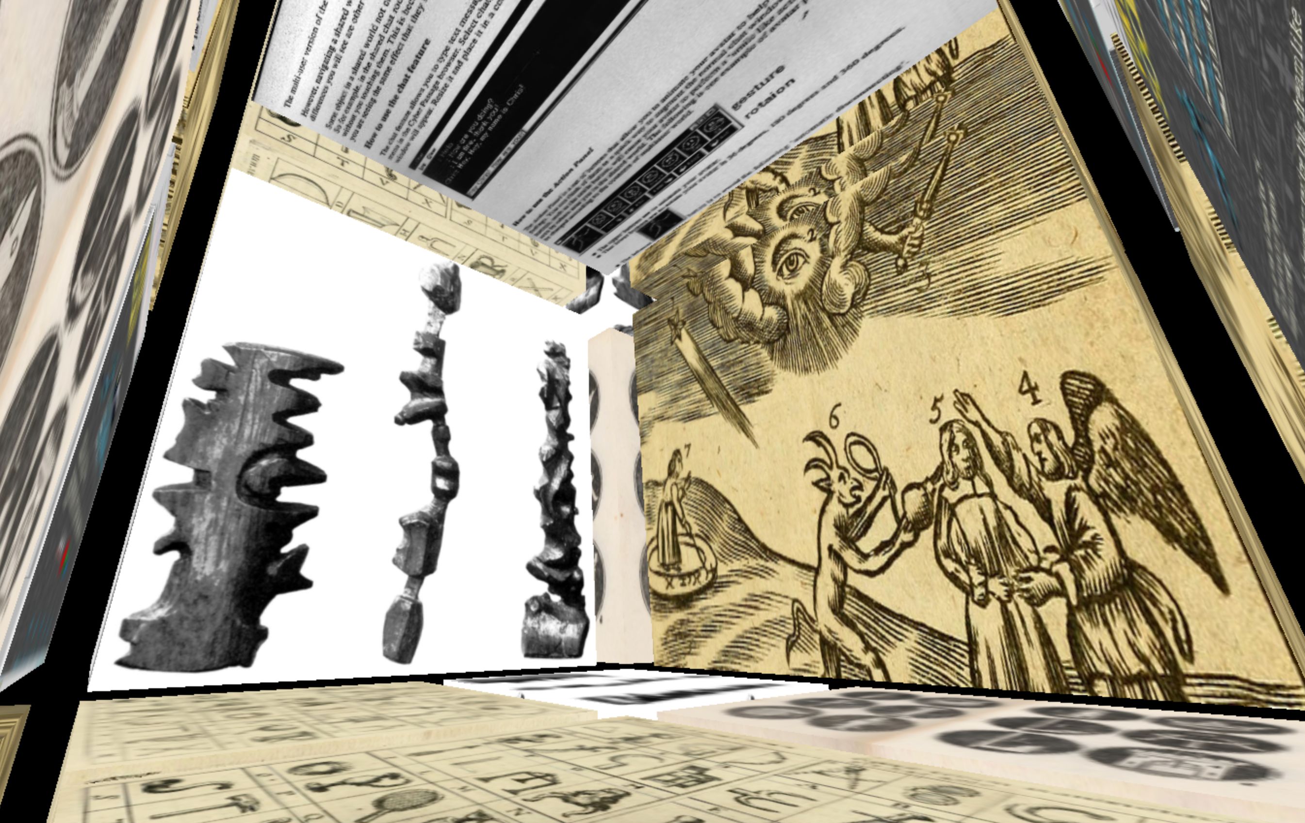
Another feedback about the cube is that it is 'not functional'. First, when you click on an image, the description is set to appear at the bottom right, but instead of all the elements of the web design being placed in space, only the cubes consisting of 'images' were placed in space, and the pages such as the descriptions seemed to stay in the 2D space. Also, in the wikicube that was experimented with in the beginning, the pages could be entered into space and interacted with directly and clicked, but in iCube, that is not possible, so I received feedback that it would be good to include it.
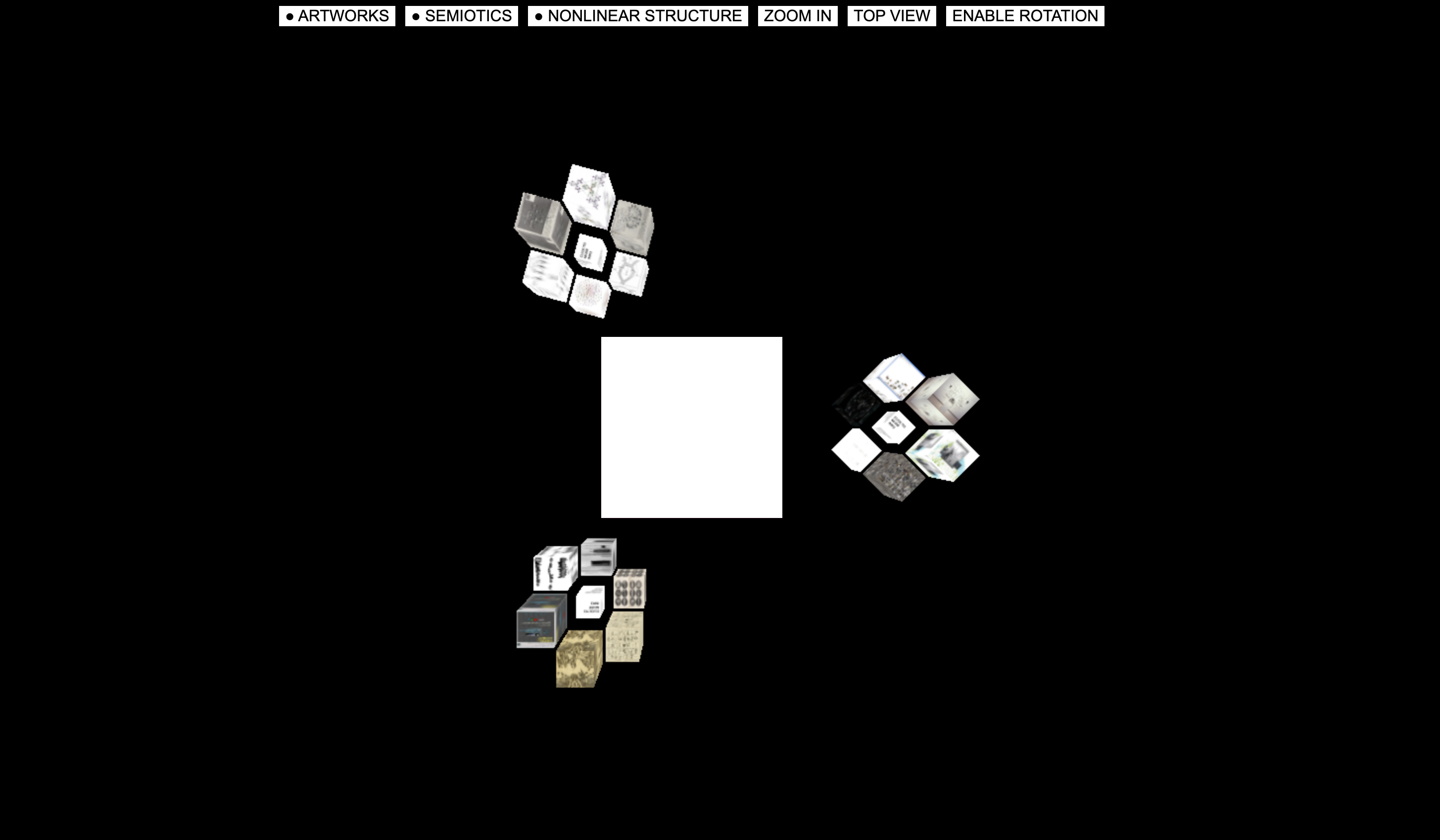
UX consideration
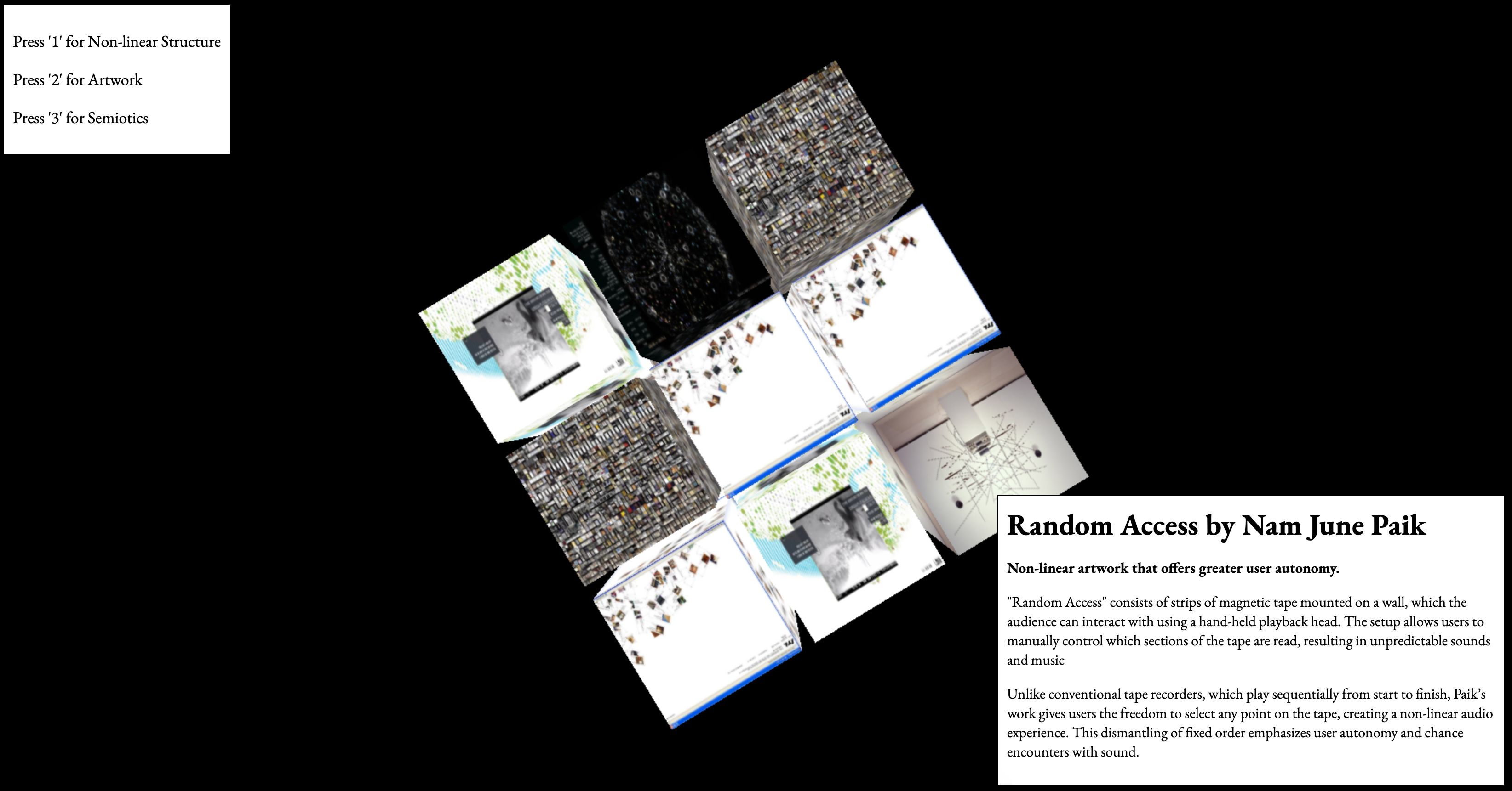
Based on the feedback, I decided to improve the website by paying more attention to UX in this cube. That's how the following 'staircase-type' cube came to be. Three cubes with a cascading structure were created for each category and placed in a row.
Feedback
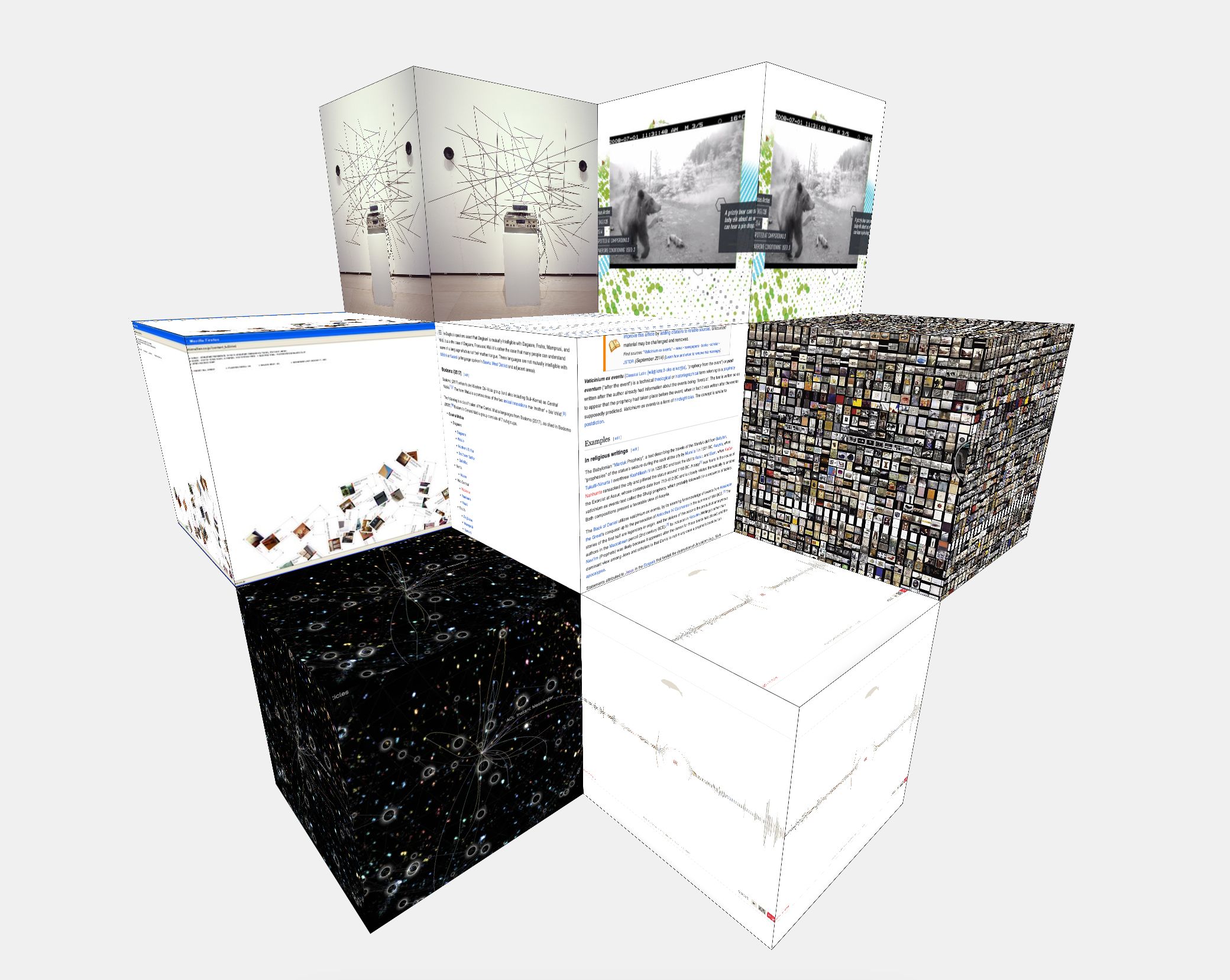
I received feedback that this layout is more in line with the direction of my project than the last one, but I learned through feedback that it still needs improvement in terms of UX. I used a library called css3d to place the iframe content and mapped it to cubes created via WebGL to use a clear rendering with images. However, since the bases of the two cubes are different, the transparent effect degrades the UX, and there are still many problems, such as the fact that zooming does not work when interacting with the page.
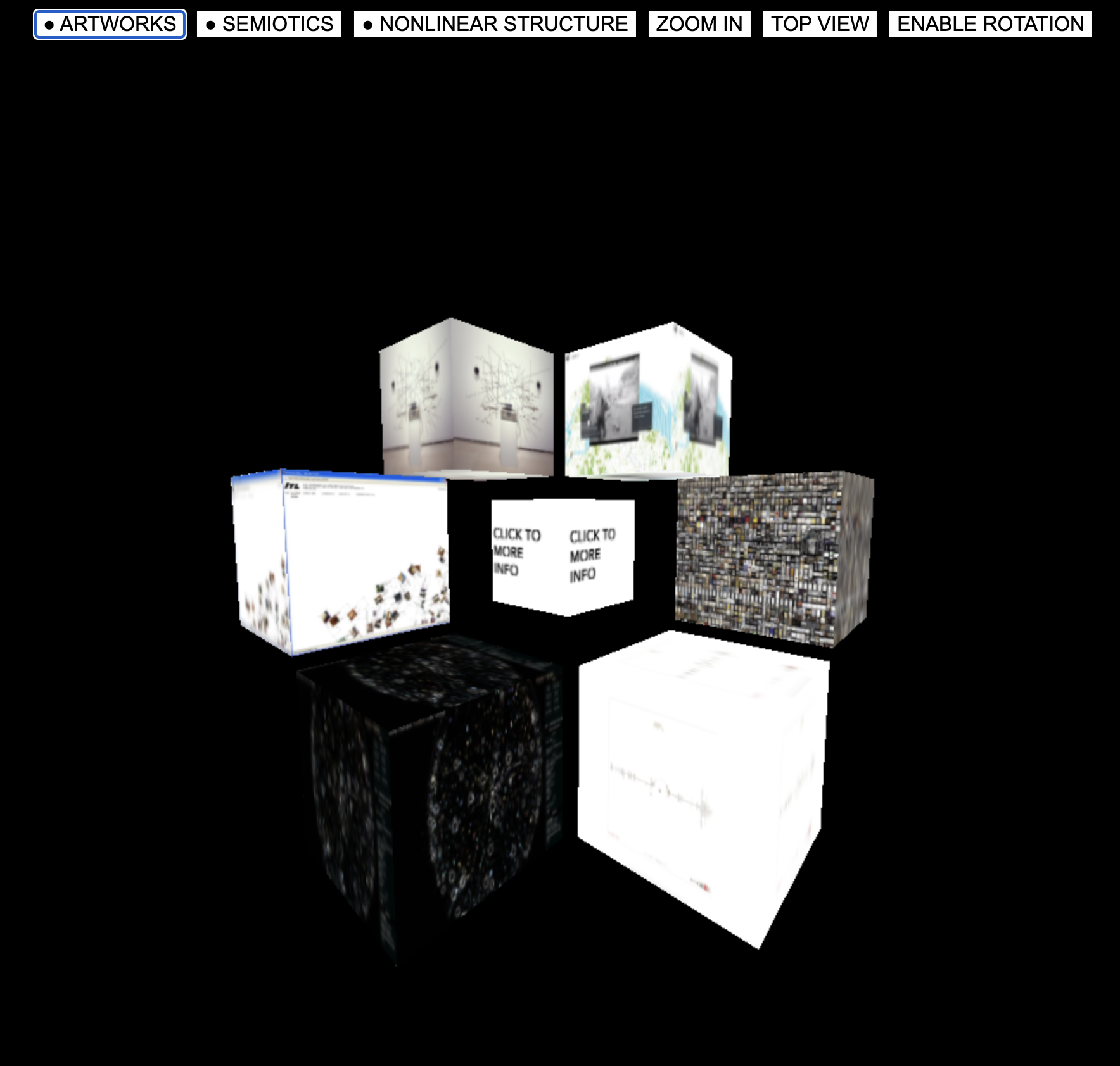
Website development
Considering all the feedback, the following layout was created. In terms of UX, I tried to solve the difficult operation by placing the button at the top, and we made each cube surrounded by a radius so that there was a distance between the cubes and browsing was done through the button. Also, when you click on the image, a website is displayed in the cube in the center of the screen so that you can see the information of the image in more detail. In the end, it was a prototype that was created, but after completing it, I realized that there were still many things to consider.
First of all, considering the UI aspect, I created a button and wrote a brief description on the button, but if there is still no description, it seems that there will be some inconvenience in using it. Also, the main cube can be rotated using the arrow keys on the keyboard, but there was no separate interface to inform of the function. And when interacting with the iframe content, the focus is still set to the iframe page and goes out of my layout, so I have to click a separate 'Enable rotation' button to rotate it again, so it seems that there were many areas for improvement.
In conclusion, I have partially succeeded in creating an experimental spatial website as a prototype, but I have found many areas for improvement, so I think I will have to consider these areas and improve them in the project that I will continue in the next semester.
Usertesting & documentation(catalogue of making)
A scene of user testing with a prototype