Open Studio
Through the open studio, I was able to explain my project to many people and receive feedback on it. I can't say that everyone who came truly understood my project or gave amazing feedback, but some of the feedback was helpful in shaping the direction going forward.
The main feedback wasn’t about improving the UI/UX of my website, but rather suggestions for references or thoughts on the usability of the site. So, I’m not sure if I’ll be able to improve the website directly based on that, but I did hear a lot of interesting feedback. There were about four points that seemed particularly helpful:
1. Muriel cooper (Mit press) / Post - Structualism
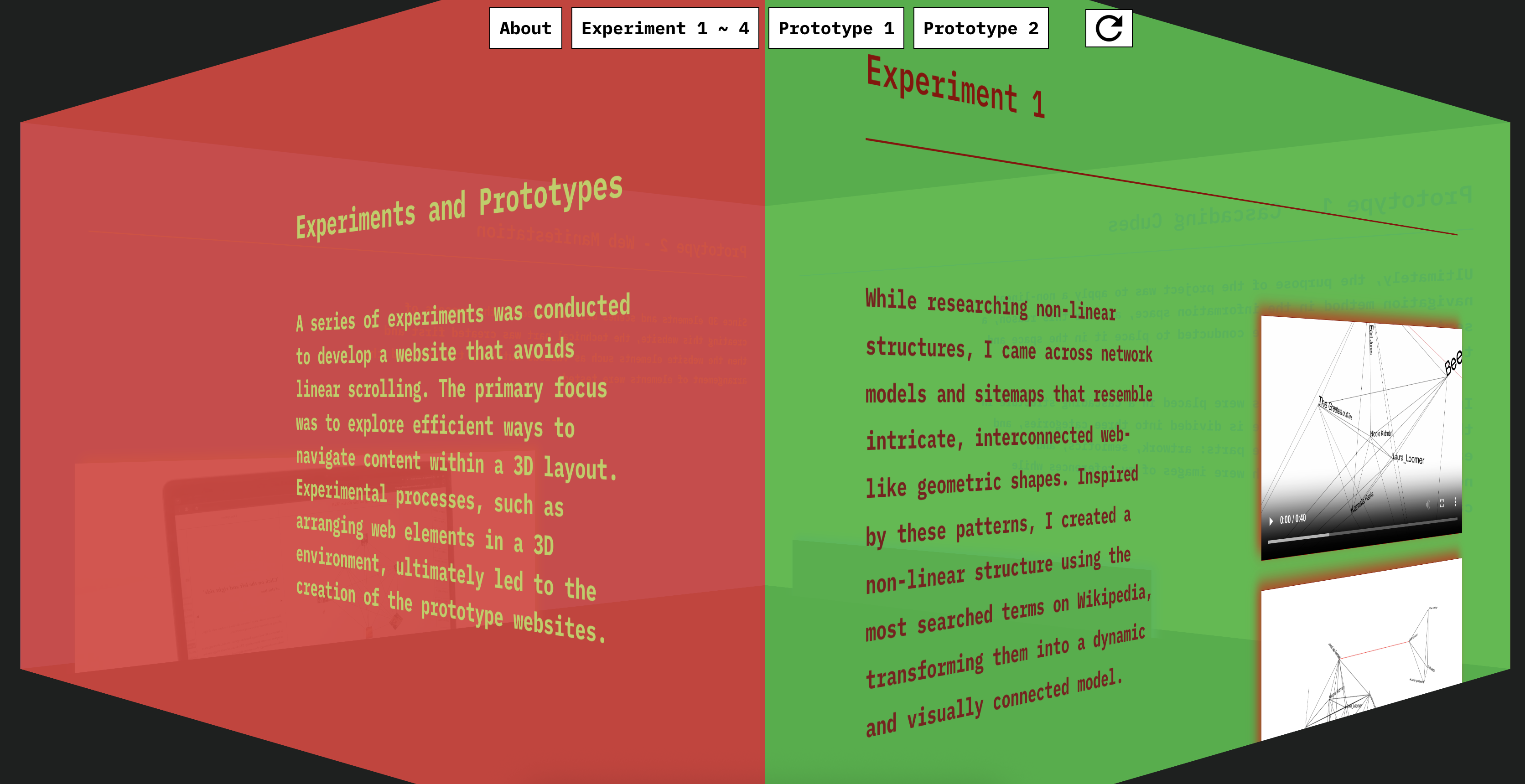
I received feedback that my project seemed similar to the work of Muriel Cooper, who experimented with placing text in 3D spaces in the early 2000s, as well as with ideas from Post-structuralism. Post-structuralism was explained to me in a simple way using the example of a hamburger: we usually think of a hamburger's structure as bun–lettuce–patty–bun, but even if the structure changes to bun–bun–patty–lettuce, the essence remains the same.I was told that this idea resembles my website, which removes the traditional scroll and breaks away from the typical structure of a website.
2. Bumpiness article Link to Article
Vikas introduced me to Mark, a type designer, who shared an article with me on the topic of bumpiness. The article seemed to talk about how a slight sense of discomfort or bumpiness in type design—or in design in general—can actually help draw the user's careful attention. It also discussed the aesthetic value that comes from this kind of bumpiness. (I’m not sure I fully understood all of it!)
3. Commercial website
An alumni who visited as an industry professional told me that using this kind of format could be helpful when advertising a new product for a specific brand.
4. Publication
I was told that it would be good to design the publication in a way that allows for a nonlinear approach, in line with my concept.
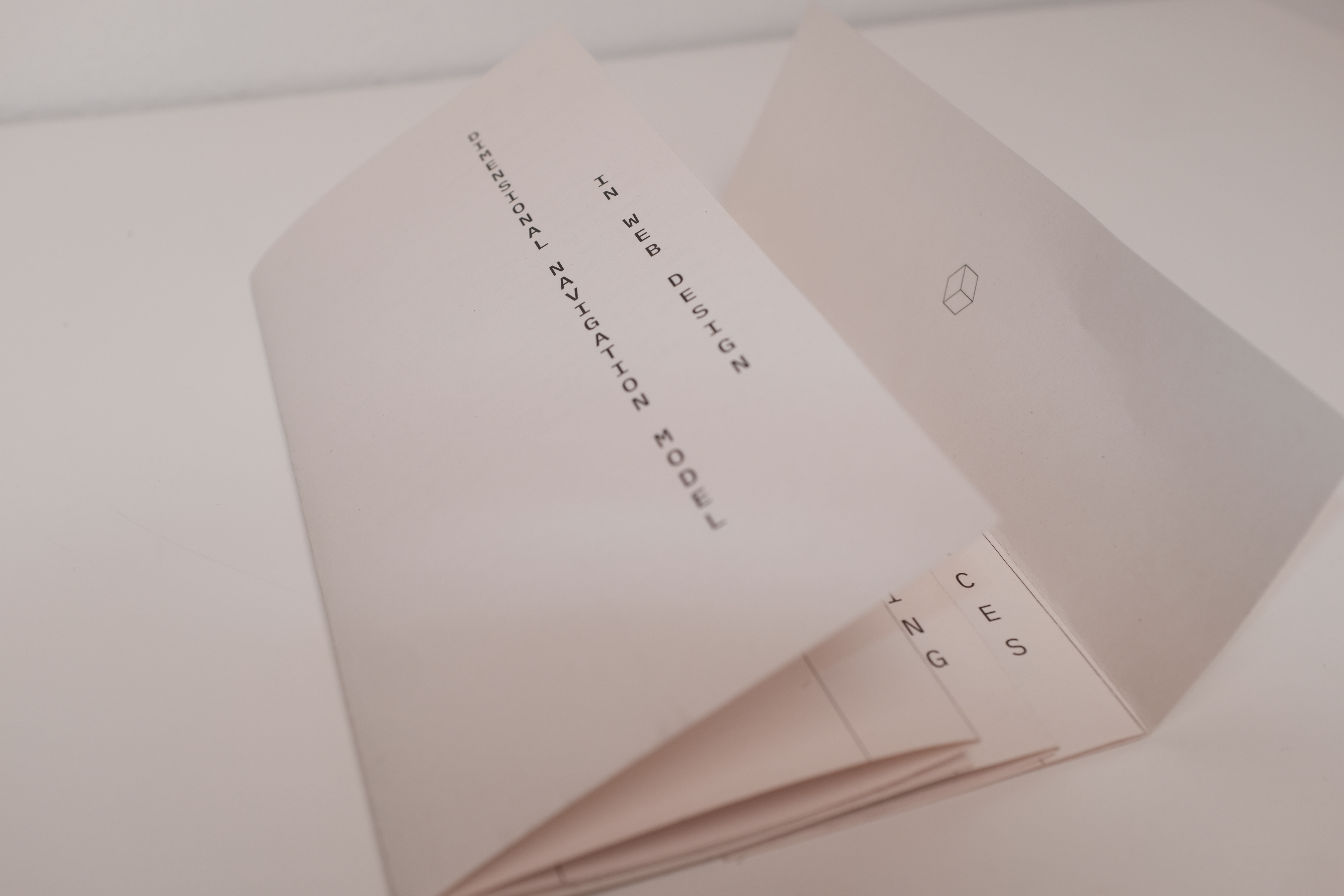
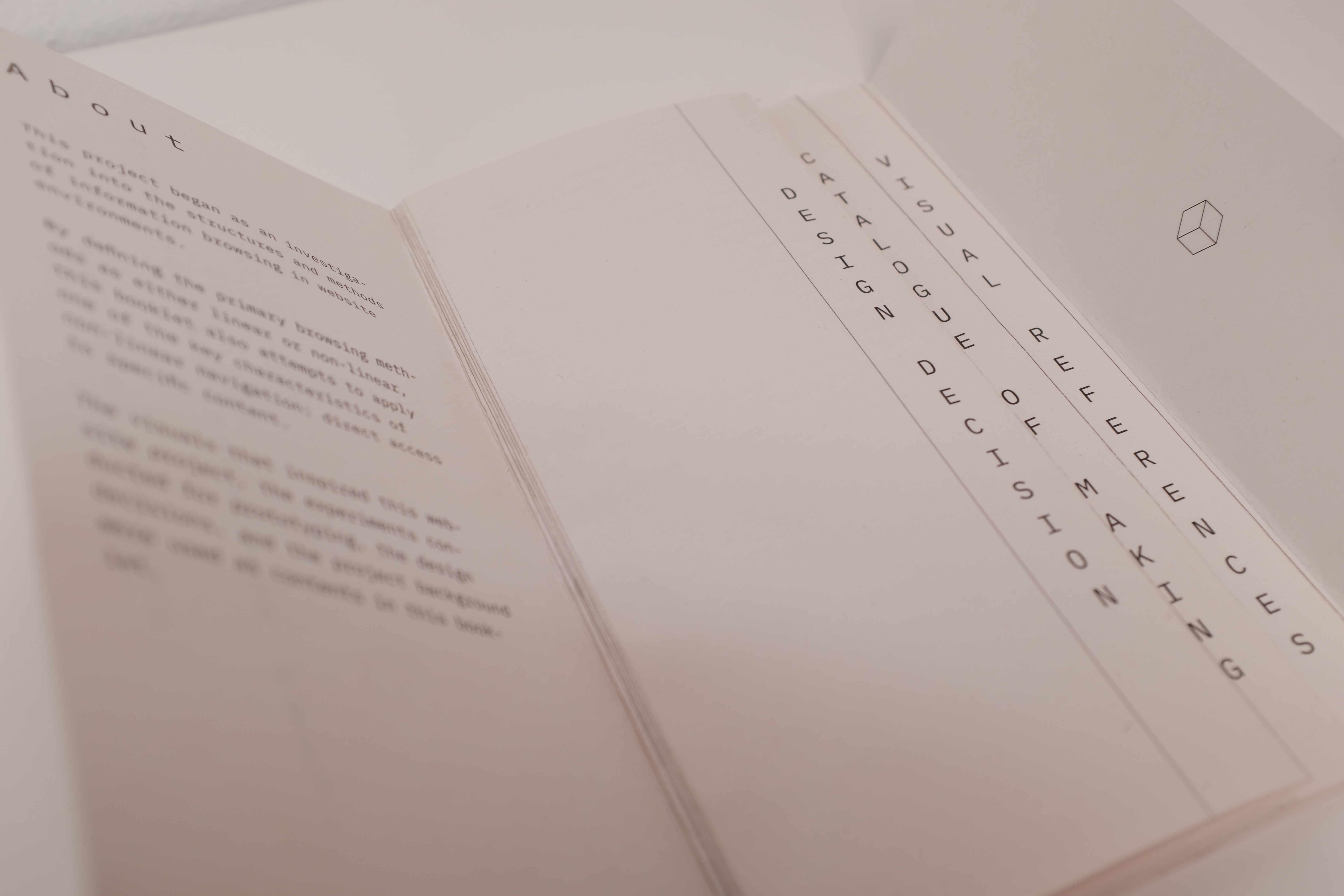
Booklet
I remade the book. Since I felt that I didn't have enough time to make a book that could be read perfectly nonlinear, I decided to design a nonlinear booklet using a simple concept. One of the browsing/navigation concepts used in my project was to allow users to access the book at the point they want, so I made a booklet that felt like you could open it from the part you wanted to see.
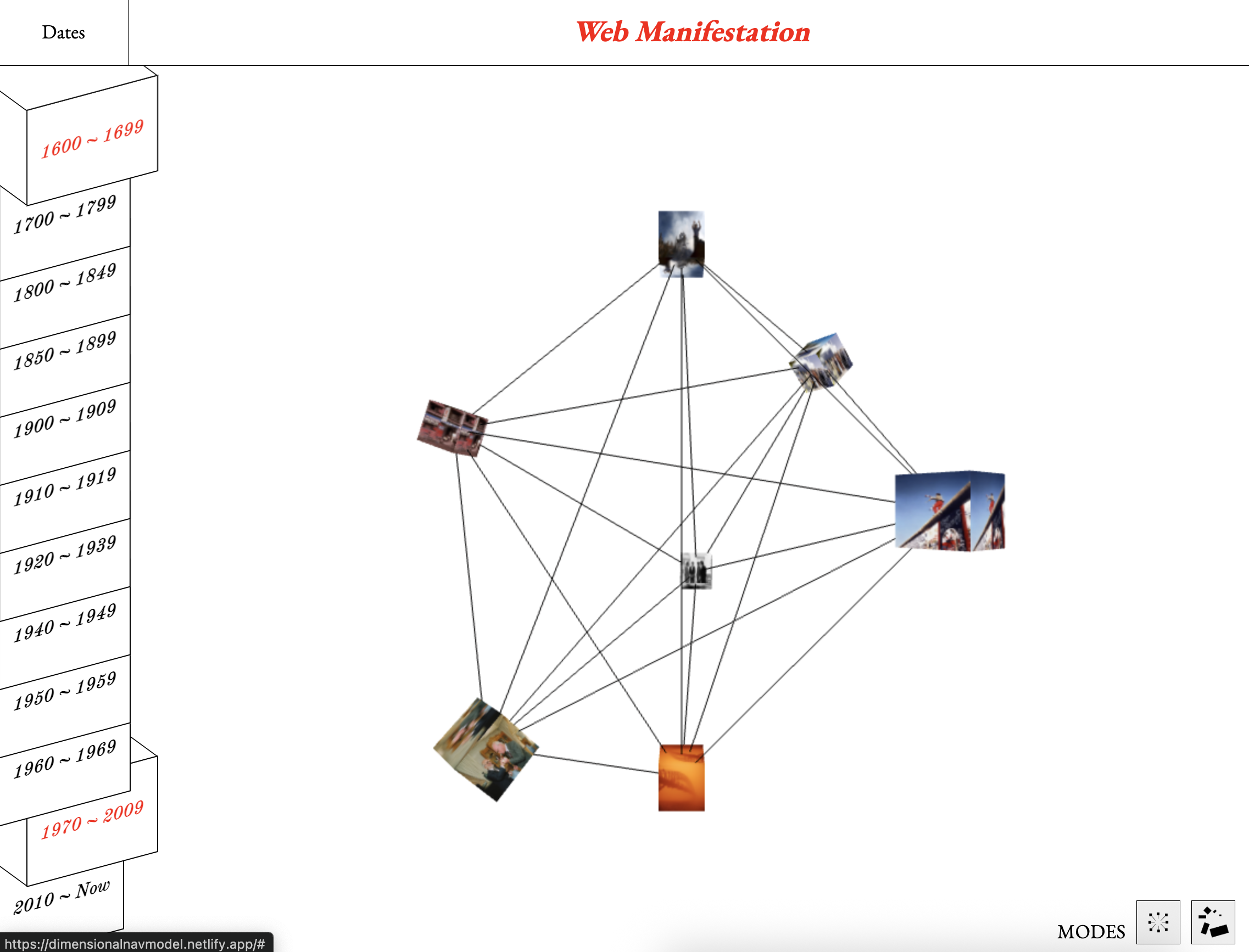
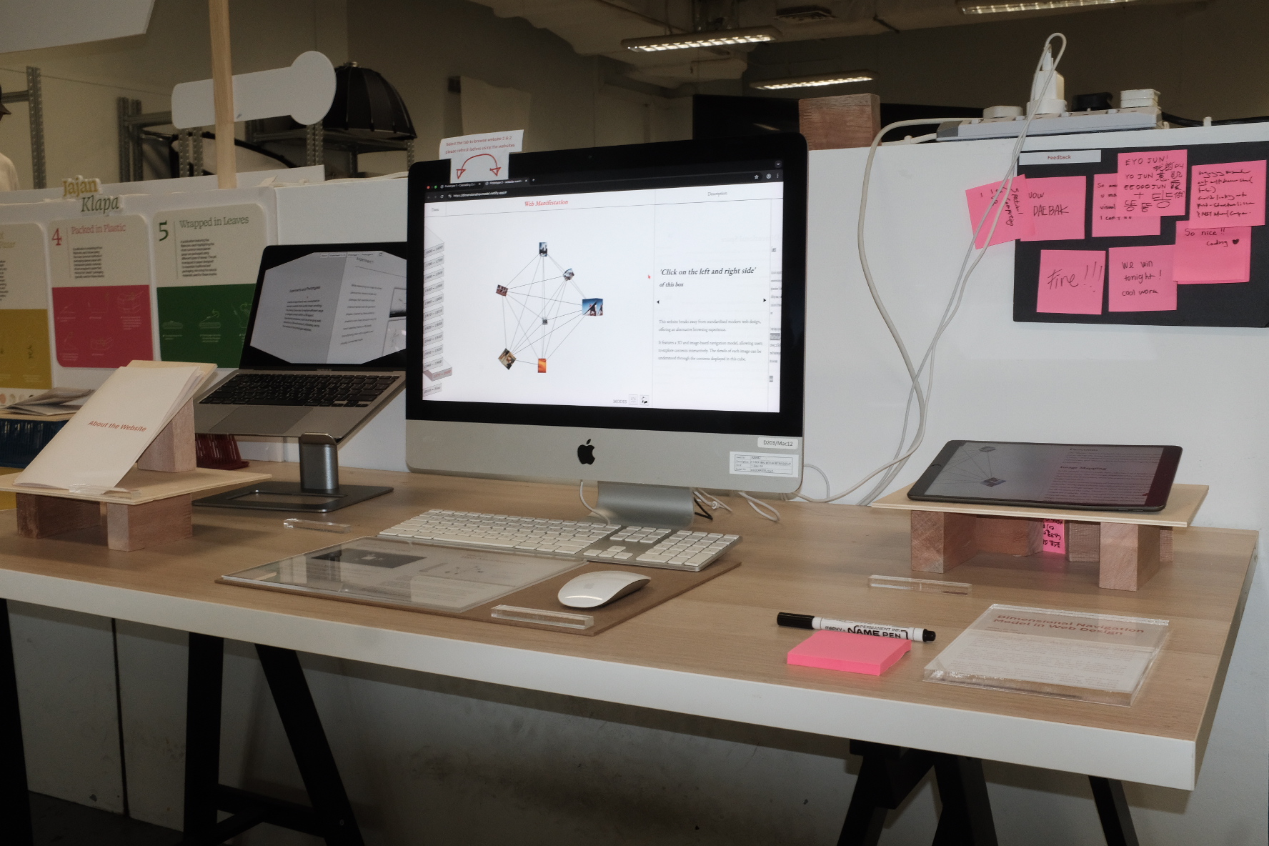
Websites (Navbar / Catalogue)
The nav bar design has been changed. The design used in the previous Open Studio did not seem to match well with the existing website in terms of color and shape, so it was changed to white and designed to look like a cube.
The colors of the catalogue of making website were also changed to resemble the colors of the cube, and photos obtained after Open Studio were added.