Go Back to Project
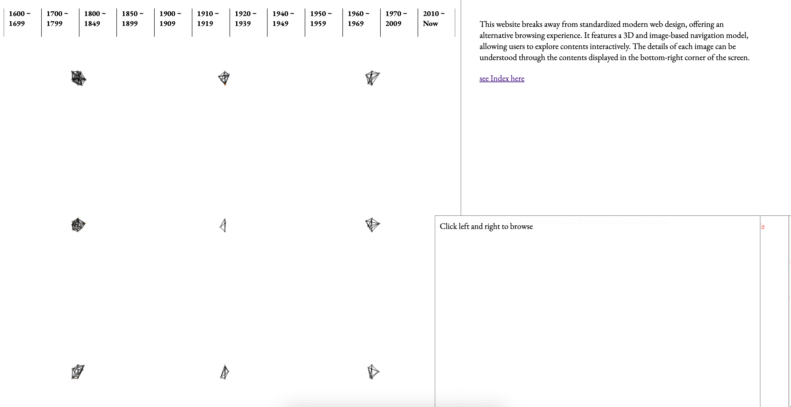
After submitting my dissertation, I was finally able to refocus on my website. While I believe the current version effectively conveys the concept I want to express, there are still many functional and design aspects—such as layout, typography, and color—that require further consideration. Additionally, since I transitioned from a cube model to a network-like structure, I realized the need for enhancements, such as displaying titles when hovering over images and adding borders to indicate which image is being browsed. These refinements will help improve clarity and user experience.
The improvements I’m currently considering include making the website responsive for mobile viewing, refining the design of the cube section where content is displayed, and adjusting the way categories transition. Right now, the movement is immediate, but I feel it would be worth exploring a more refined transition. Additionally, I need to rethink the first page that appears when the website initially loads to ensure a more cohesive experience.
I decided to start by implementing the title display feature, as it plays a crucial role in the UI. As I continued development, I noticed that the codebase and interface elements were naturally expanding. Keeping this in mind, I revisited Krishna’s book, The Best Interface is No Interface, which emphasizes minimizing interfaces rather than adding more. The book argues that while people often associate better UX with additional UI elements, but excessive interfaces can actually hinder the experience. I found myself agreeing with this perspective to some extent, and it also felt relevant to addressing the fundamental issues of my website. With this principle as a foundation, I proceeded with the development, aiming to refine the experience rather than complicate it.
Regarding the layout, I started by merging the separate features I had developed for the Thursday class display, but the images and HTML files were not yet linked, and the positioning of the content-display cube still felt uncertain. However, since my priority was refining interactions within the 3D scene, I decided to focus on improving the Three.js implementation first and leave the overall website layout adjustments for the final stage. Although submitting my dissertation has given me more time to focus on the website, there are still many areas that need improvement. The list of problems to solve remains long, but I see this as an opportunity to refine the project step by step.
First Page Layout Exploration
Display and Feedback
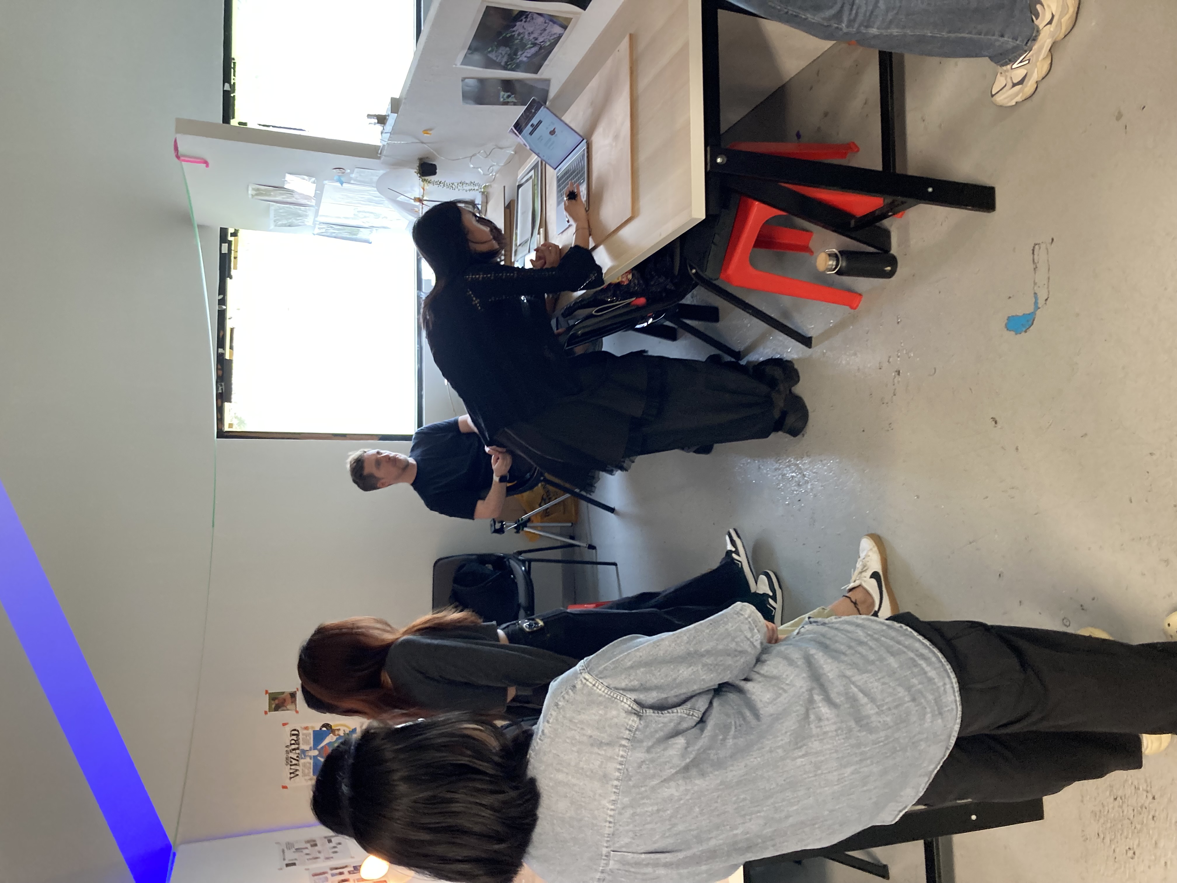
I had my first class after submitting my dissertation, and I realized that my intense focus on the dissertation had inevitably led me to neglect keeping up with my CPJ. During the session, I received brief feedback on both my CPJ and project progress, which helped me reflect on the gaps in my documentation. Setting up a simple table overview also provided a clearer perspective on the project's development so far, allowing me to assess its trajectory more effectively.
Setting up the table, even in a simplified form, made me realize a key issue with my display. My website carries a certain narrative, and each feature has a reasoning behind its approach. However, with my current setup, conveying that story to others proved to be challenging. While I had prepared descriptions and a brief publication, I started questioning whether they were enough. From the perspective of someone encountering my work for the first time, the context should be as immediately understandable as it is in web design. This made me realize the need for a more intuitive and structured display—one that effectively communicates the underlying narrative behind my approach.
Since my display primarily revolves around a website presented on a desktop monitor, I decided to incorporate a simple flipbook-style publication to provide additional context. This would help make the project’s narrative and rationale more accessible, ensuring that viewers can quickly grasp the background and approach behind my work.
Further Developments After Feedback
The table setup didn’t necessarily provide groundbreaking feedback on my project, but it did help me clarify which areas needed improvement. Since I already had a sense of what needed refinement, I focused on solving smaller issues one by one.
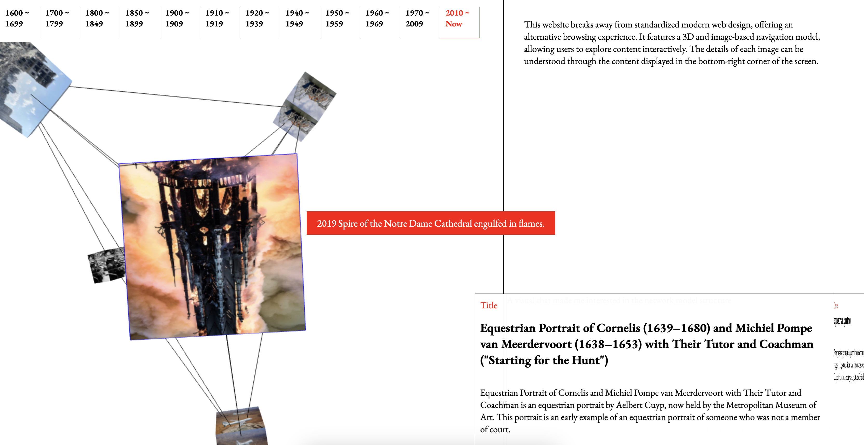
One noticeable problem was the image mapping on the cube—some sides were correctly aligned, while others appeared flipped horizontally. To fix this, I adjusted the existing image assets, ensuring they mapped accurately and looked seamless within the 3D space.
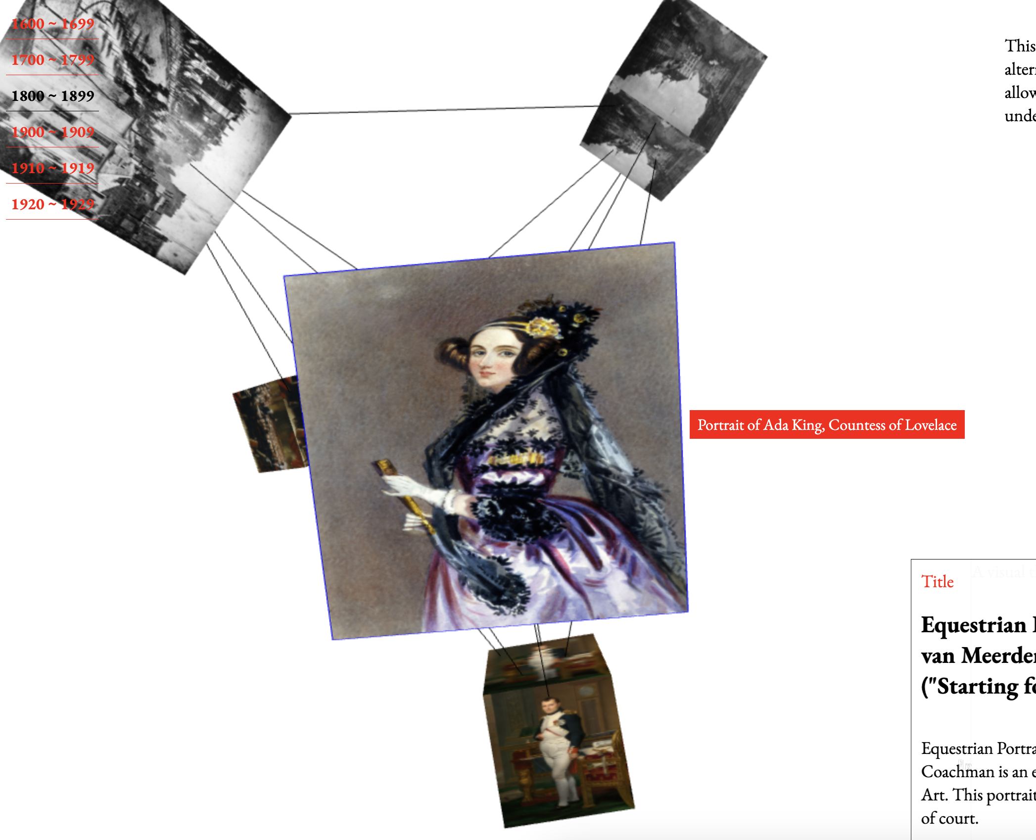
I also felt that the layout of the year display was poorly designed and not well-organized. To improve this, I repositioned it to the top-left corner of the screen, allowing users to select categories more intuitively.
Because I wanted to create a website that deviates from conventional formats, I actively explored new approaches to layout and structure. However, through this process, I realized that while my website challenges traditional web design, certain elements—such as categories and content organization—still need to follow familiar patterns. Rather than completely discarding existing conventions, I needed to adapt and modify them in a way that aligns with my concept.
If the website’s structure were too experimental and unfamiliar, users would likely struggle to navigate it. I came to understand that a well-designed UX doesn’t necessarily mean breaking all conventions, but rather finding a balance—retaining familiar elements while introducing meaningful changes that make the experience unique.