Round Table v2
Since getting feedback from the last roundtable session, I feel that the functional aspects of my website are almost complete. Wanting to hear different perspectives, I received roundtable feedback from Vikas and Nicholas.
Vikas shared feedback on the my current website, explaining it to a "physicalized" version of the web. Using a library as an example, he noted how users can instantly grasp the layout of information in real world library, similar to how categories in my website provide an overview of each category at a glance. He also agreed that Wikipedia’s outdated code structure could benefit from functional improvements. This perspective felt interesting, especially since I had used a similar example for instruction text in Sem 1.
I didn’t receive much design-related feedback, but Nicholas pointed out that since the content is pre-categorized, it can still feel somewhat sequential or chronological—contrary to the project’s goal of nonlinear navigation. He suggested a new categorization method, such as selecting "animals" to display related cubes.
While useful, I felt that implementing all these changes could disrupt the UX. The book The Best Interface Is No Interface emphasizes that too many UI elements can hinder rather than improve UX. Keeping this in mind, I decided to refine the layout to maintain a smooth, intuitive flow without overwhelming the user.
CID lab
I received feedback on aspects of the website's main UI that could be improved. Since there were many intertwined elements in how the code was used, I was able to gain ideas on how to improve that part through a lab consultation. In particular, Andreas identified key issues with the animation method I added in W9 and provided a detailed explanation, which was very helpful in improving the functionality.
Since I had been focusing on developing navigation elements in the 3D environment and interactive website elements triggered by clicks, there was still plenty of room for improvement in terms of individual styling and layout placement of these elements. This made me realize the importance of maintaining consistency across all website elements, such as setting uniform borders.
I identified areas for improvement, such as the placement of the title in the middle of the website, font usage, and animation speed. After combining these insights with feedback from the roundtable discussion, I decided to work on improving the layout. Following Andreas' recommendation, I used Adobe Illustrator to explore layout arrangements and how the elements could be unified into a cohesive website design.
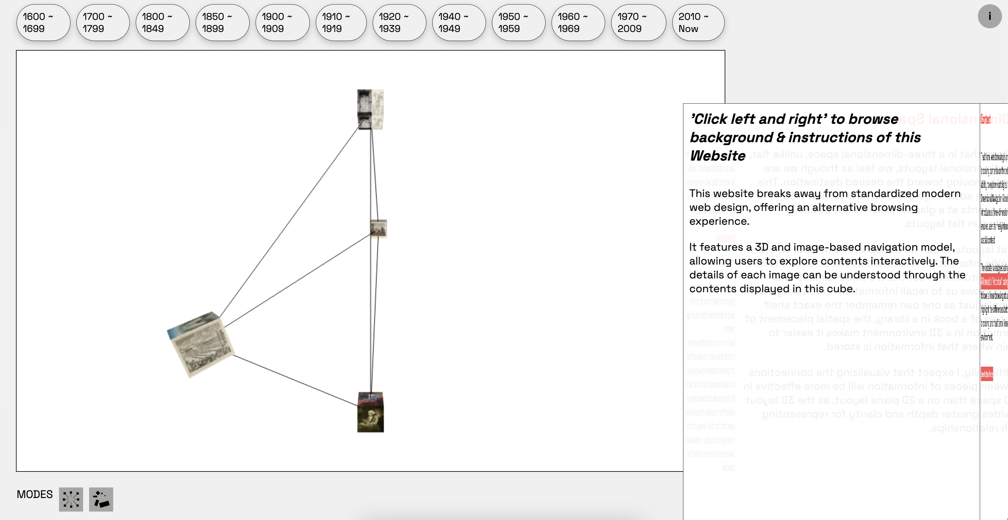
Got feedback of this layout
Layout Trial
During the process of building a website with 3D, technical issues with coding led me to focus on developing functionality first and test the layout and button designs. Feedback from the lab consultation pointed out that I needed to adjust elements such as the content's line-height and font padding. With the functionality mostly resolved, I decided to test the layout and refined the details using Adobe Illustrator.
Layout
I explored a few layout ideas using Illustrator, which helped me decide on the final arrangement of the website.
As mentioned earlier, since I had developed the website's functions separately, integrating them posed some challenges. As seen in Layouts 1 and 2, the code structures for the 3D scene and the content cubes were different, so one of the key issues was figuring out how to make them appear as a unified element.
I believed that the placement of content played an important role in the overall experience, so I planned to have it occupy most of the screen. In Layout 3, the content and 3D scene were arranged vertically, so I also redesigned the buttons to align vertically and added a narrow tab at the top to support better understanding.
After sketching out the overall layout, I began thinking about the design of individual elements. In the feedback I received on the first layout, it was pointed out that while most elements were rectangular, the navbar buttons used border-radius, which felt inconsistent.
To address this, I explored various options for the buttons, their placement, and the icons to create a more cohesive visual language.
Nav bar design
Next, I tested different navigation button styles—such as circular arrangements and scroll-based formats—but ultimately chose a 3D-inspired design. Since the overall scene was built in 3D and utilized cube-like structures, this approach felt the most cohesive.
One piece of feedback from Vikas during the roundtable that stood out to me was the idea of “physicalizing the web,” using a library as a metaphor. Inspired by that, I added an animation effect that mimics picking a book from a shelf to reinforce the spatial and conceptual consistency of the website.
Also, by applying this type of category design, I thought that it would be possible to facilitate access from the desired part, which is one of the nonlinear features that played a fundamental role in my project.
Final Layout
Finally, the following layout was created. Since the functional part had to be resolved first, the 3D part, content part, and category part were created separately, and it was difficult to merge them, but in the end, a consistent layout was created to match the cube and the concept of my website that applied the 3D environment.
Since my current website focuses on navigation that eliminates scrolling, I think it is difficult to completely replace or use the modern website environment, and I think the concept of nonlinear has also become quite vague, but I felt like this project was carried out with the feeling of the realization of the web and the visual expression of information structure.
As for the UI/UX part of the website layout, I decided to get feedback from open studio and improve it further, and I decided to think about how to prepare for the situation where this website does not work on desktop and how to optimize the code in case it does not work.-
Got feedback of this layout 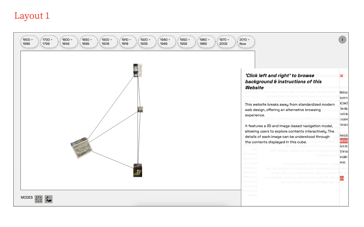
layout trial 1 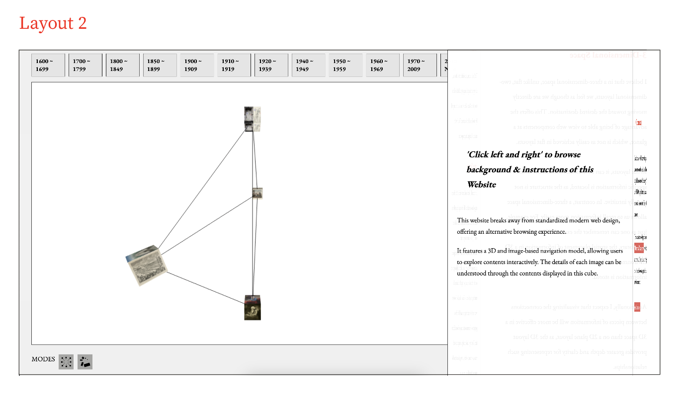
layout trial 2 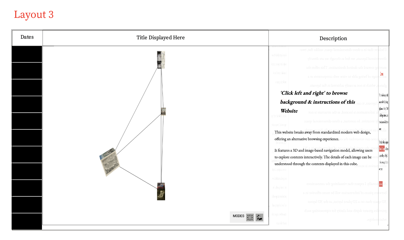
layout trial 3 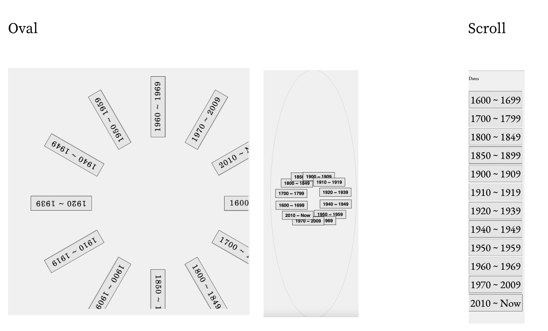
navigation bar 1 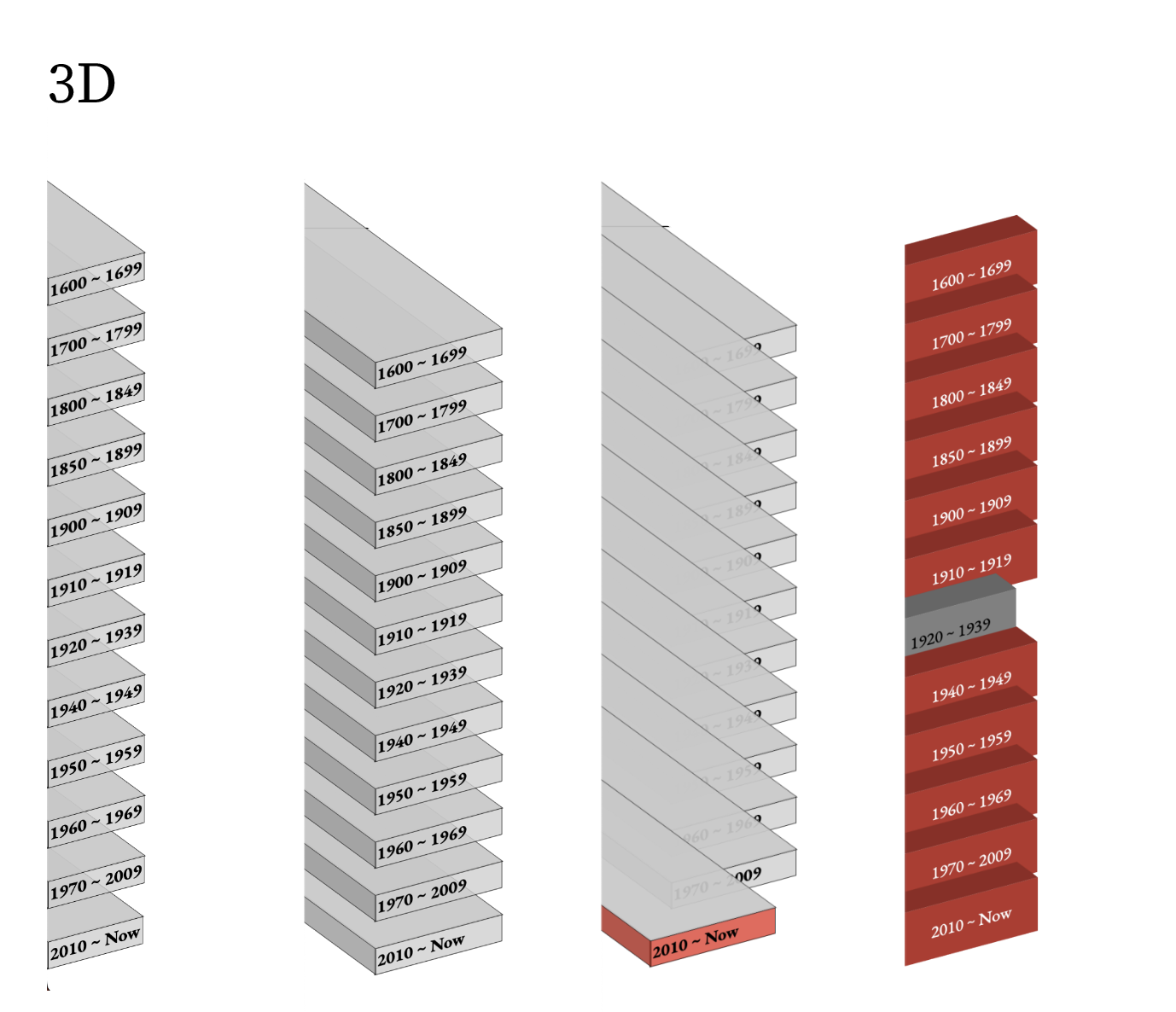
navigation bar 2 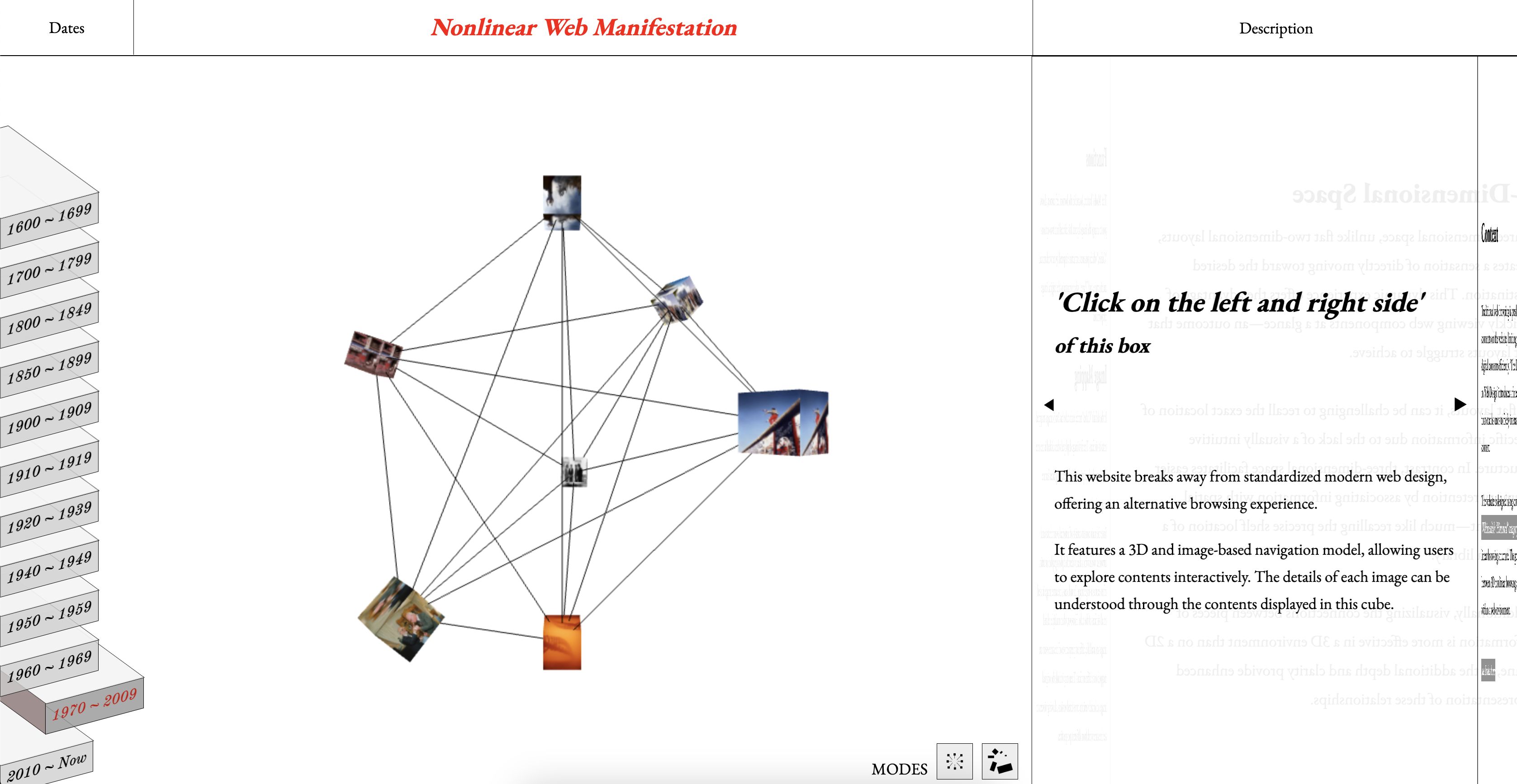
Final Layout