Layout, UI, UX improvements
Through the feedback and one user testing response, I realized that significant improvements in UI and UX were urgently needed. The user testing response helped me understand fundamental interface issues that I had overlooked. Visually, the website was considered engaging and had the potential to attract interest. However, users found it unclear what content each image represented, meaning they had to click on them to check the actual content.
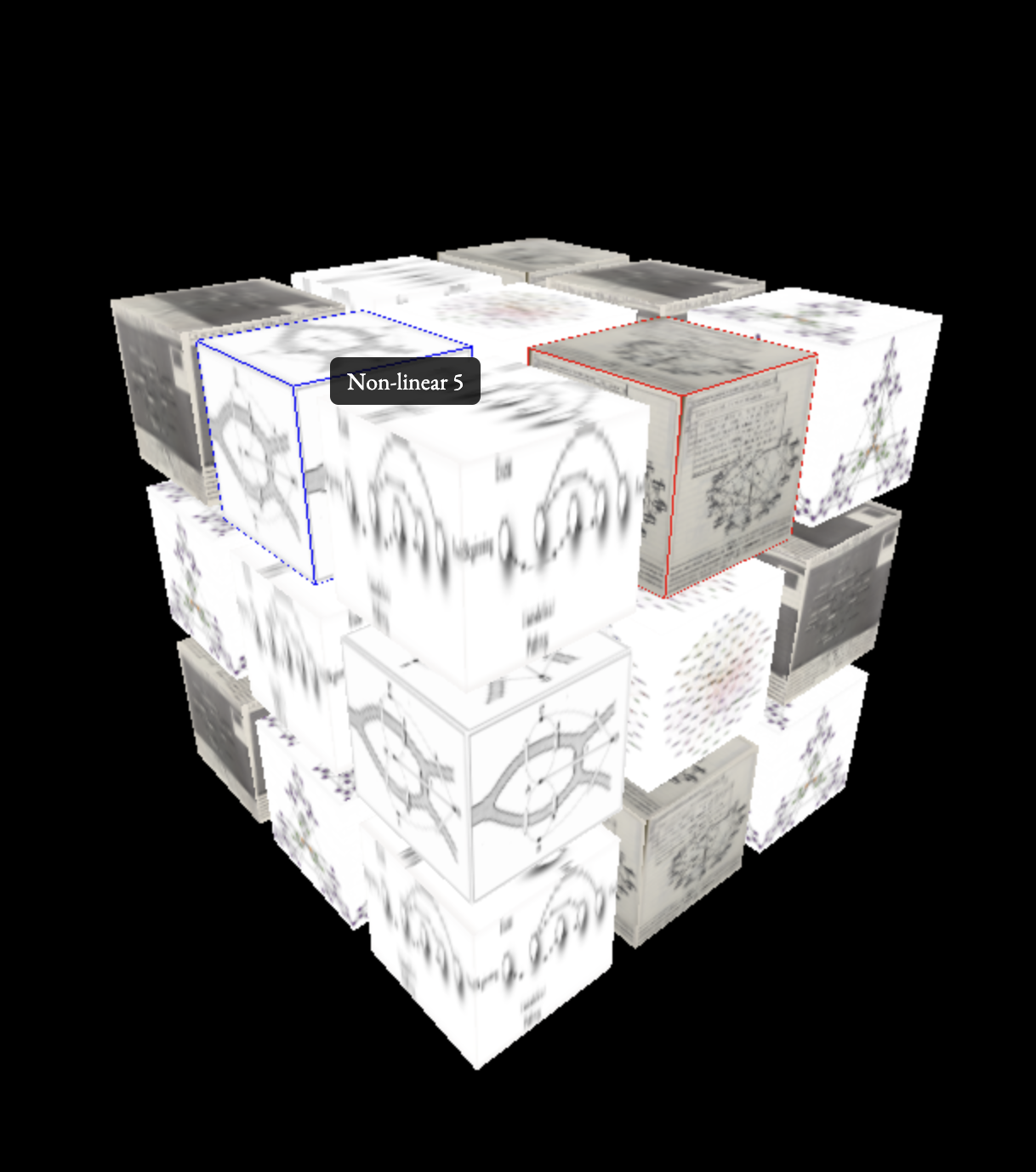
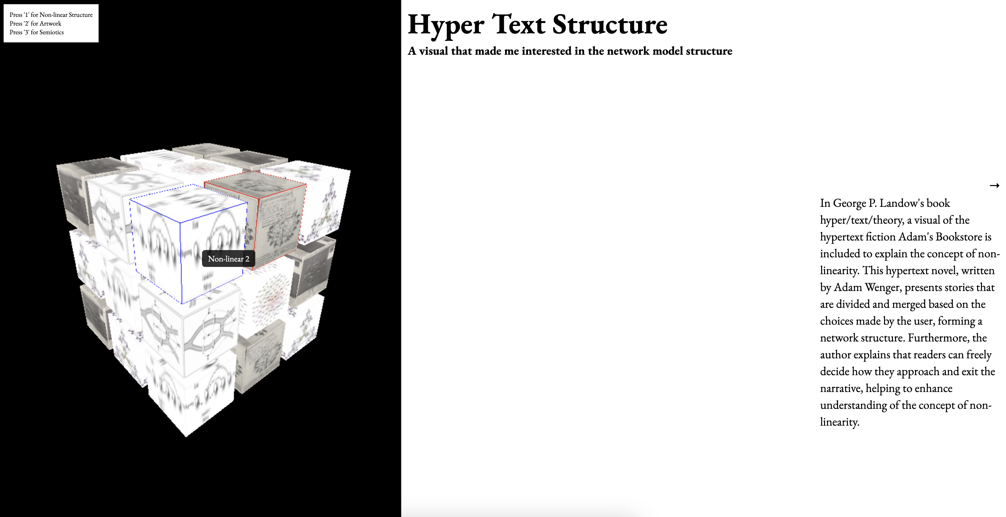
Based on this feedback, I modified the interface by adding a border line to the selected cube and displaying the content title when the mouse hovers over it. Regarding the overall layout, I made changes to the 3D layout I created during Semester 1. Instead of keeping the entire layout in a 3D environment, I left only the navigation section in 3D while displaying the content on the right side of the screen. This adjustment improves the website's usability and shifts the rendering method from using Three.js with CSS3D content display to a cube-based page built purely with HTML, CSS, and JavaScript, making interactions more intuitive. Each piece of content is displayed when the user clicks on a cube with a mapped image. The displayed page consists of four sections, and users can navigate through them using the keyboard arrow keys.
The book The Best Interface Is No Interface, which I read as a reference for my dissertation, was highly influential in shaping the overall design of my website.
In this book, the author discusses not only web design but also various types of "interfaces" in the world. One of the key principles emphasized is that a good interface should allow users to instantly understand its functions at a glance.
Inspired by this idea, I realized that to create a good UI and UX environment, the website must be intuitive and comprehensible—at least for its intended audience. It should not be a website that only I, as the developer, can understand.Insights
Receiving feedback, making improvements, and deeply considering UI and UX allowed me to rethink the overall design. Through user testing and feedback from others, I realized the importance of viewing the project from different perspectives.
I learned that creating a "Best Interface" isn’t just about web design—it’s about ensuring that the design is understandable and accessible, rather than something only a designer’s perspective can grasp. Additionally, through experimenting with various coding approaches, I gained insights into which code libraries are most compatible with each other and how to combine them effectively to ensure smooth interactions.
Overall Feedback
With this slightly improved layout, I was able to receive additional feedback. While the improvements were valid, I was told that they were too minimal. Through group feedback, I also became more aware of the overall issues with my website project. Due to the content of my dissertation and the ambiguous explanations I had given in previous feedback sessions, Andreas mistakenly thought I was attempting to develop an entirely new, experimental website aimed at changing all existing websites.
Of course, since I am a designer rather than a developer, I never had such an ambitious plan to replace all existing websites. Instead, I decided to scale down the scope of my dissertation and website application, focusing on choosing a proper area where my project could be effectively applied.
Additionally, while I initially used the cube layout because I had worked with it before and found the code convenient, I realized that if I continued using this layout, it could become problematic as the content expanded. For instance, if the number of cubes increased significantly—such as forming a massive 100x100 grid—it would still force a linear exploration process, which could hinder usability. Because of these potential issues, I decided to reconsider and modify the 3D model aspect of the project.
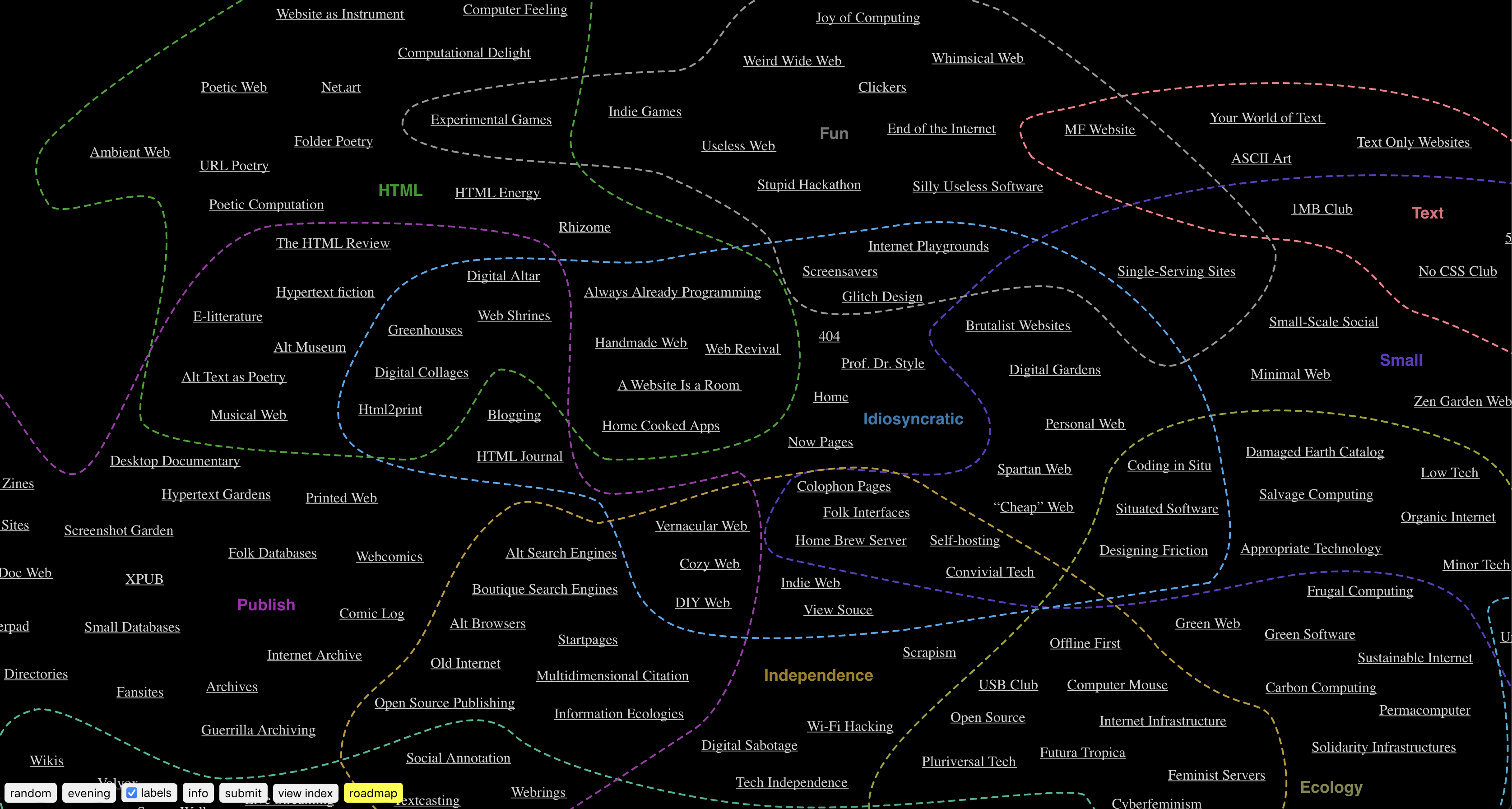
Another piece of feedback I received was a recommendation to reference the website diagram.website This site functions as a rhizomatic archive, categorizing and grouping websites based on their format. I found its structure and design elements to be quite helpful for my own project. Additionally, diagram.website organizes its content using Google Sheets, which gave me the idea to do the same for my website. I realized that structuring and sorting my content this way could make organization and management much more convenient, so I decided to implement a similar approach.
Through this feedback, I realized that there are still significant issues with the website I'm working on, but it also provided a lot of clarity on which direction to take moving forward. One of the key points mentioned during the feedback was the gap between the user's perspective and the designer's perspective, which I had also brought up earlier. With this in mind, I plan to focus on narrowing that gap and improving the website accordingly.
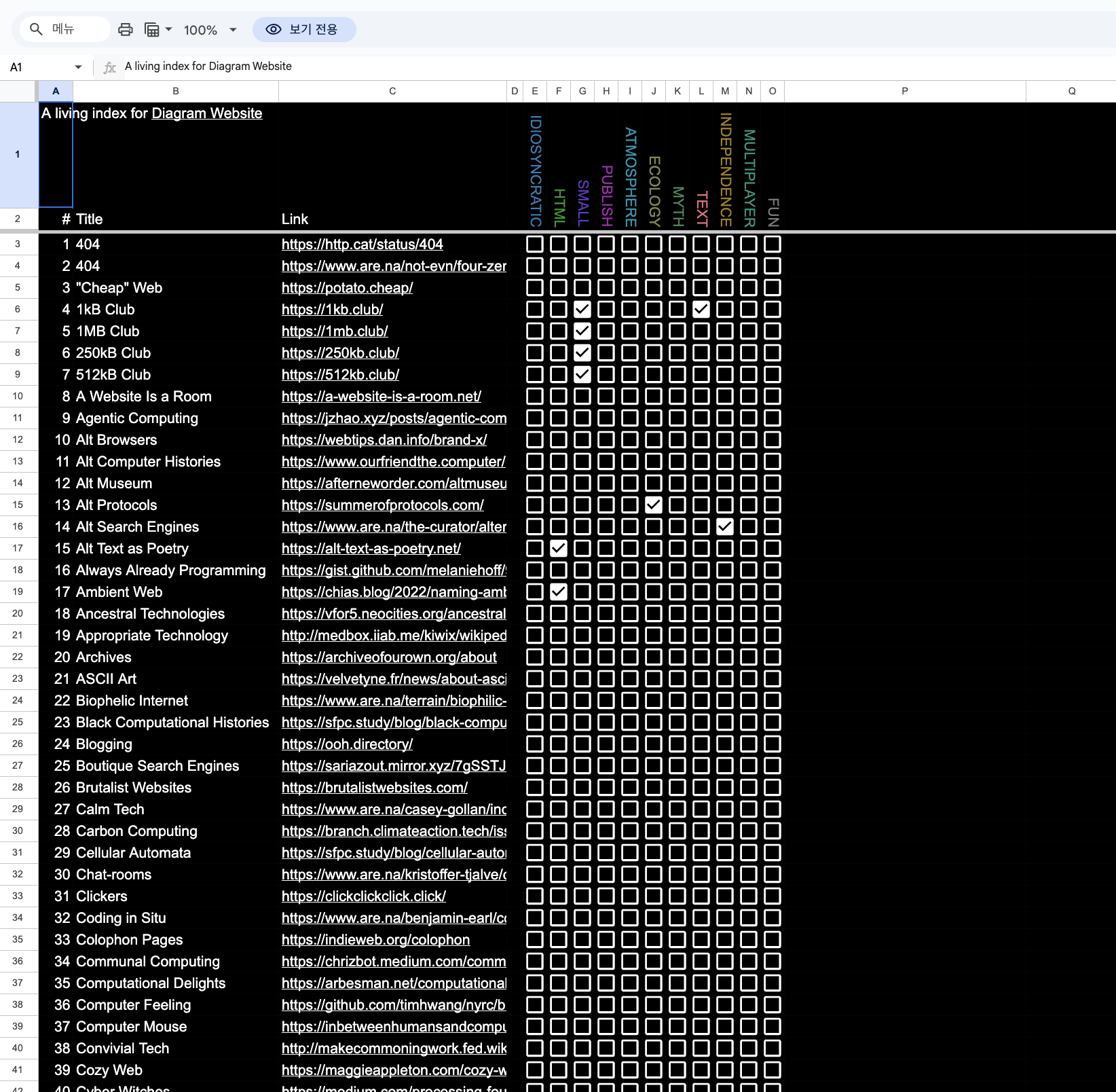
google sheet index
Dissertation
Since I've decided to scope the topic, I plan to narrow down the content of my dissertation and choose a more focused subject. This will help ensure a clearer direction and more manageable scope for both the dissertation and the website project.